Colour · June 23, 2026
Interior Design Colour Trends 2026 (and the Colours of the Year)
The 2026 colour authorities split — Pantone went white, the paint brands went warm and earthy. What that contrast tells you, every colour of the year, and how I'd actually paint a room.

The headlines wanted a single colour of the year for 2026. Instead the authorities had an argument. Pantone crowned a white. The paint brands reached for brown, khaki, and jade. When the people whose entire job is predicting colour can't agree, that disagreement is more useful than any one pick.
The colours of the year 2026, and why they split
Here's the slate, and the contrast that makes it interesting. Three of the four big names leaned warm and grounded. Pantone went the opposite direction entirely.
| Authority | 2026 pick | My one-line take |
|---|---|---|
| Pantone | Cloud Dancer (a soft white, reportedly PANTONE 11-4201) | Their first-ever white; gorgeous in theory, cold in practice unless your light is warm. |
| Benjamin Moore | Silhouette AF-655 (charcoal-brown, plum undertone) | Moody and enveloping; brilliant in a study, risky in a north-facing room. |
| Sherwin-Williams | Universal Khaki SW 6150 (warm tailored neutral) | The most usable of the bunch for whole-room work. |
| Behr | Hidden Gem N430-6A (smoky jade) | Behr reportedly went green; lovely on cabinetry, less so on four walls. |
So what do you do with a split verdict? You don't chase one brand. In my experience the smarter move is to read the overlap across all of them, and the overlap is clear: warm, earthy, grounded. Three picks point that way. Pantone's white is the outlier, and outliers tell you what the consensus is by standing against it.
If I were betting, Cloud Dancer is the marketing story and Silhouette and Universal Khaki are the colours people will actually live with. White-of-the-year reads beautifully in a press release. In a real Canadian living room in February, a cool stark white can turn the whole place grey and clinical by four in the afternoon.
The real 2026 palette
Forget the four headline names for a second. The broader direction for 2026 is a family of colours, not a single shade, and it's the most coherent palette I've seen in years.
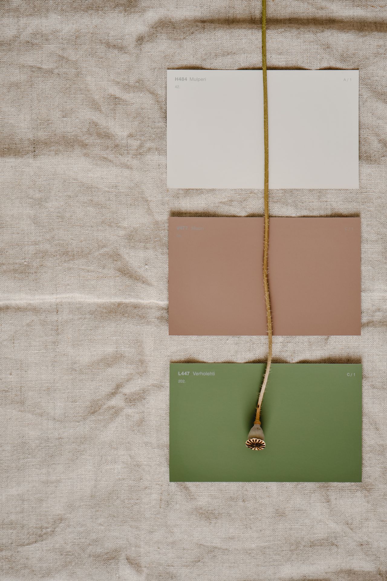
The grounding tones are olive, clay, ochre, oxblood, deep teal, mushroom, and warm chocolate brown. These are the colours doing the heavy lifting on walls and large furniture. What anchors them matters just as much: warm off-whites that carry a faint pink or yellow undertone, not the cool blue-greys we all overdosed on for a decade. That shift, from cool whites to warm whites, is the quiet engine behind everything else this year. It's why brown and khaki suddenly look right instead of dated.
You can see this thinking in our own work — the way we used warm green and earth tones in the Maison Verte project was leaning this direction before the 2026 decks landed. It reads as current now precisely because it was never about a trend colour; it was about colours that flatter natural light and real materials. The same logic runs through the rest of our portfolio.
How to actually use colour in a room
A list of trendy colours is worthless without a method for placing them. Here's mine.
Choose paint last
This is the single biggest mistake I see, and it's so common it deserves to go first. People fall in love with a paint chip, buy the paint, then try to make a floor and a sofa obey it. Backwards. Paint is the cheapest and most changeable thing in the room. Your hardwood, your stone counter, your big upholstered pieces — those are expensive and semi-permanent, so they go first. Then you find a colour that flatters them.
Pick the paint to serve the room. Never make the room serve the paint.
Undertones beat hue names
"Greige" tells you almost nothing. Two greiges with identical marketing names can read warm taupe on one wall and cold green-grey on another, depending on what sits beside them and how the light falls. The hue name is the headline; the undertone is the story. When I'm choosing a neutral I hold it against the actual floor and the actual stone, in the actual room, and watch which way it leans. Universal Khaki, for instance, can swing yellow or green depending on its neighbours — that's not a flaw, it's just something you have to look for before you buy ten litres.
Test large, and in real light
Do not trust a chip under the fluorescent ceiling of a paint store. That lighting is engineered to make every colour look decent, which is the opposite of helpful. Buy sample pots. Paint big patches, at least 60 by 60 centimetres, on more than one wall, a colour behaves differently on a wall facing the window than on the wall beside it. Then live with the patches for a few days.
Check them in morning light, in flat afternoon light, and at night under your own bulbs. Which brings me to a thing most people forget entirely: a warm bulb around 2700K will pull every colour warmer and softer, while a cool 4000K bulb will strip that warmth out and make the same paint look harder. The colour you choose and the light you light it with are one decision, not two.
Balance it with 60-30-10
The old rule still holds because it works. Roughly 60 percent of the room is your dominant colour, usually walls and large surfaces. About 30 percent is a secondary colour, often big furniture or curtains. The last 10 percent is your accent, the oxblood cushion, the ochre lamp, the deep teal on a single cabinet. This is where bold colour belongs in 2026. Drench the room in a quiet grounded tone, then let one of the richer earth colours do something small and confident.
Mistakes, trade-offs, and what I'd avoid
The feature wall is the offender I argue about most. One bold wall facing three white ones rarely looks designed; it looks like someone ran out of nerve halfway through. If you want colour, commit. Paint the whole room, run the colour up onto the trim and even the ceiling, and let it wrap around you. Colour drenching a small powder room or study reads as far more intentional than a lone accent wall ever has.
The honest trade-off underneath all of this is bold versus timeless. Silhouette AF-655 in a dining room is a genuinely beautiful, brave choice, and it's also the kind of dark, specific colour you may tire of in five years. A warm off-white will never thrill anyone, and it will also never embarrass you. Neither answer is wrong. You just have to know which game you're playing before you open the tin. My rule of thumb: be bold in rooms you pass through and use at night, be calm in rooms you live in all day.
The most expensive paint mistake isn't a colour you hate. It's a colour you chose first, that now forces you to buy around it.
If you want the wider context for where colour sits among everything else moving this year, I wrote about the full picture in my 2026 interior design trends piece, and about how I use software to test palettes before committing in my guide to AI design tools and trends. Both pair well with this one.
My prediction for 2026
Cloud Dancer will win the headlines and lose the living rooms. The colours people actually paint this year will be the warm, grounded ones, the khakis, the clays, the chocolate browns, the dusty greens like Behr's jade, because warm minimalism has real staying power and cool white has finally exhausted its welcome. I think we'll also see colour creep onto ceilings and trim far more than onto single accent walls, as colour drenching moves from bold experiment to default move.
And the deeper shift won't be any one shade. It'll be people choosing colour last, testing it large, and trusting their own light over a chip, which is the only trend I've ever fully endorsed. If you're staring at a wall and a fan deck right now and feeling stuck, that's exactly the conversation I like having. Book a consultation and we'll start from your floor and your light, not from someone else's colour of the year.
People also ask
- What is the colour of the year for 2026?
- There isn't one — the authorities split, which is the real story. Pantone chose Cloud Dancer, a soft white, reportedly its first-ever white pick. Benjamin Moore went with Silhouette AF-655, a charcoal-brown with plum undertones. Sherwin-Williams chose Universal Khaki SW 6150, a warm tailored neutral. Behr reportedly picked Hidden Gem N430-6A, a smoky jade. Most leaned warm and grounded.
- What are the interior design colour trends for 2026?
- Warm and earthy, used as grounding tones rather than accents. Expect olive, clay, ochre, oxblood, deep teal, mushroom, and warm chocolate brown, anchored by warm off-whites that carry a pink or yellow undertone instead of cool stark whites. The cold grey era is genuinely over. The mood is rich, quiet, and tactile rather than loud.
- What is Pantone's colour of the year for 2026?
- Cloud Dancer, a soft, almost stark white, reportedly PANTONE 11-4201. It's notable because it's Pantone's first-ever white pick, which is why it made headlines. It sits against the paint brands, who all leaned warm. In a home I'd treat it as a tone to handle carefully — cool whites can read cold and clinical unless your light and materials warm them up.
- What is Benjamin Moore's colour of the year 2026?
- Silhouette AF-655, a deep charcoal-brown with plum undertones. It's a moody, enveloping colour that suits a study, a powder room, or a dining room you use at night. I'd pair it with warm brass, oak, and soft 2700K lighting so the plum reads as richness rather than gloom. Test a large sample after dark before you commit.
- What colour did Sherwin-Williams choose for 2026?
- Universal Khaki SW 6150, a warm tailored neutral that sits between greige and soft tan. It's the most usable of the 2026 picks for whole-room work because it behaves well in many light conditions. Watch the undertone against your floor and stone, though — khaki can swing green or yellow depending on what's next to it and how warm your bulbs are.
- What is Behr's 2026 colour of the year?
- Behr reportedly went with Hidden Gem N430-6A, a smoky jade. It's a soft, slightly dusty green that fits the warm-earthy direction without being a brown. Greens like this work beautifully on cabinetry, a kitchen island, or built-ins. I'd keep it off all four walls of a small dark room, since dusty greens can flatten without enough natural light.
- What is the most important rule when choosing paint colours?
- Choose paint last. Pick your floor, stone, and large upholstery first, then find a colour that flatters them — paint is the cheapest and most flexible thing to change, so it should follow, not lead. After that, the rule is undertones over hue names. Two beiges with the same name can read warm or pink or green depending on what surrounds them.
- How do I test a paint colour properly?
- Never trust a small chip under store lighting. Buy sample pots, paint large patches — at least 60 by 60 cm — on more than one wall, and live with them for a few days. View each patch in morning light, afternoon light, and at night under your actual bulbs. Colour shifts dramatically with light direction and bulb temperature, so test in the room it will live in.
- Are feature walls still a good idea in 2026?
- Usually not. The single accent wall often reads as a dated stunt and chops up a room. If you want colour, I'd rather you paint a whole room a quiet, grounded tone, or run colour onto trim and ceilings for a wrapped, enveloping effect. Colour drenching a small space tends to look more intentional than one bold wall facing three white ones.